Plotly is a library use for data visualization. Users can visualize and analyse the data online. This library is use for developing interactive graphs and charts. It is Free and open source plotting library that allows nearly about 40 unique chart and plot types, covering a huge range of algebraic, economical, geographical 3 -Dimensional and scientific user cases. Plotly library of python is develops on the top of Plotly JS.
Installation
pip install plotly
Package Structure
Plotly package has three main modules are Following :-
- plotly.tools
- plotly.plotly
- plotly.graph_objs
Plotly tools
This module contains many helpful functions facilitating and enhancing the Plotly is knows as plotly.tools
Plotly graph object
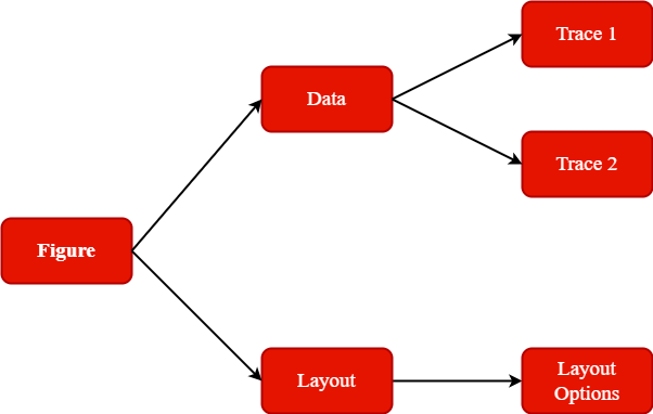
This module is the most important module that contains all of the class definitions for the objects is knows as plotly.graph_objs.
There are following graph object
- Figure,
- Data,
- Layout,
- Different graph traces
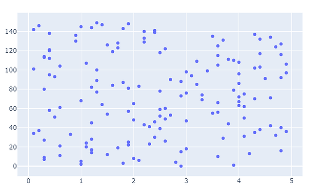
Scatter Plot
Scatter plot represent values for two different numeric variable is knows as Scatter Plot.
Example of Scatter Plot
importnumpy as np
importplotly
importplotly.graph_objects as go
importplotly.offline as pyo
fromplotly.offline importinit_notebook_mode
init_notebook_mode(connected=True)
x =np.random.randint(low=2, high=53, size=154)0.1 y =np.random.randint(low=2, high=53, size=154)0.1
fig =go.Figure(data=go.Scatter(x=x, y=y, mode=’markers’))
fig.show()
Output of Scatter Plot
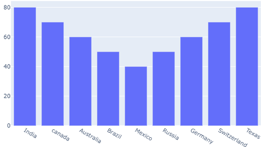
Bar charts
Bar charts are use to compare different groups of data and make inferences is knows as Bar charts
Example of Bar charts
importnumpy as np
importplotly
importplotly.graph_objects as goo
importplotly.offline as pyo
fromplotly.offline importinit_notebook_mode
init_notebook_mode(connected =True)
countries=[‘India’, ‘canada’ , ‘Australia’,’Brazil’, ‘Mexico’,’Russia’ , ‘Germany’,’Switzerland’, ‘Texas’]
responding y for each
fig =go.Figure([go.Bar(x=countries,
y=[80,70,60,50, 40,50,60,70,80])])
fig.show()
Output of Bar charts
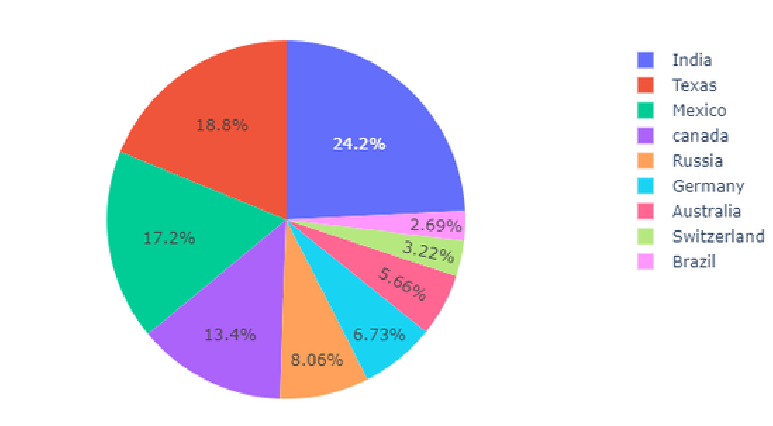
Pie chart
A pie chart represents the distribution of different variables among total is knows as Pie chart.
Example of pie chart
import numpy as np
import plotly
import plotly.graph_objects as go
import plotly.offline as pyo
from plotly.offline import init_notebook_mode
init_notebook_mode(connected = True
countries=[‘India’, ‘canada’,’Australia’,’Brazil’,’Mexico’,’Russia’,’Germany’,’Switzerland’,’Texas’]
values = [4505, 2507, 1053, 550,3205, 1507, 1250, 595, 3496]
fig = go.Figure(data=[go.Pie(labels=countries,values=values)])
fig.show()
Output of pie chart
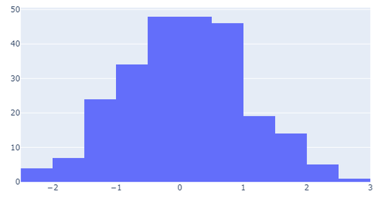
Histogram
This plots the continuous distribution of variable as series of bars is knows as Histogram.
Example of Histogram
import numpy as np
import plotly
import plotly.graph_objects as go
import plotly.offline as pyo
from plotly.offline import init_notebook_mode
init_notebook_mode(connected = True)
np.random.seed(41)
x = np.random.randn(252)
fig = go.Figure(data=[go.Histogram(x=x)])
fig.show()
Output of Histogram
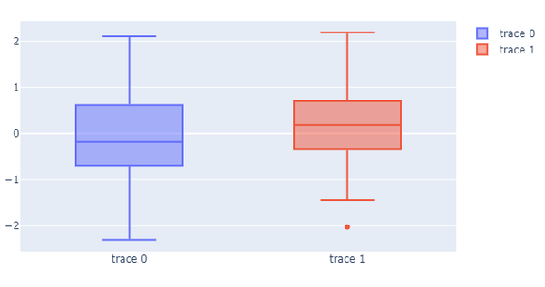
Box plot
This plot is the representation of a statistical summary. Minimum, First Quartile, Median, Third Quartile, Maximum is knows as Box Plot
Example of Box Plot
import numpy as np
import plotly
import plotly.graph_objects as go
import plotly.offline as pyo
from plotly.offline import init_notebook_mode
init_notebook_mode(connected = True)
np.random.seed(40)
y = np.random.randn(52)
y1 = np.random.randn(52)
fig = go.Figure()
fig.add_trace(go.Box(y=y))
fig.add_trace(go.Box(y=y1))
fig.show()
Output of Box Plot
Online and Offline Plotting
Online Plotting
The online plot are save in your plot.ly account. Online plots are generate by two methods
- py.plot()
- py.iplot()
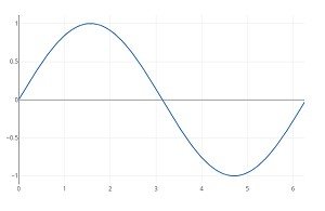
Example of Online Plotting
import plotly
import plotly.plotly as py
import plotly.graph_objs as go
import numpy as np
import math

xpoints = np.arange(0, math.pi*2, 0.05)
ypoints = np.sin(xpoints)
trace0 = go.Scatter(
   x = xpoints, y = ypoints
)
data = [trace0]
py.plot(data, filename = 'Sine wave', auto_open=True)
Output of Online Plotting
Offline Plotting
The offline Plot is generate graphs offline and save in local machine. plotly.offline.plot() function creates a standalone HTML. Use plotly.offline.iplot() when working offline in a Jupyter Notebook.
Note − Plotly’s version 1.9.4+ is need
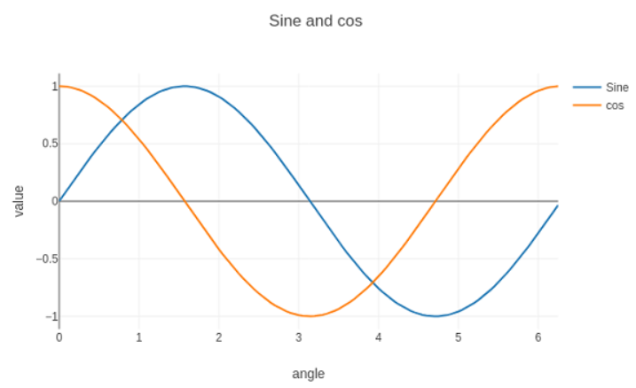
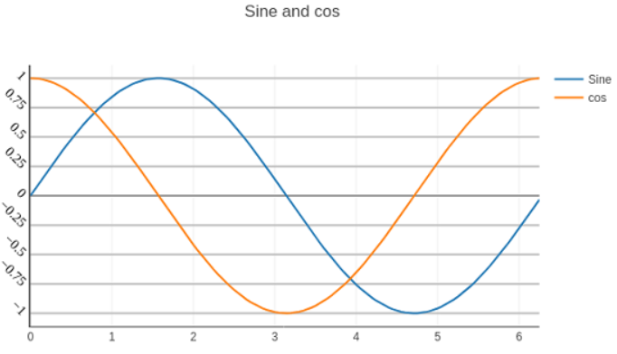
Scatter traces
Example of two scatter traces
import numpy as np
import math
xpoints = np.arange(0, math.pi*2, 0.05)
y1 = np.sin(xpoints)
y2 = np.cos(xpoints)
trace0 = go.Scatter(
   x = xpoints,
   y = y1,
   name='Sine'
)
trace1 = go.Scatter(
   x = xpoints,
   y = y2,
   name = 'cos'
)
data = [trace0, trace1]
layout = go.Layout(title = "Sine and cos", xaxis = {'title':'angle'}, yaxis = {'title':'value'})
what = go.Figure(data = data, layout = layout)
iplot(what)
Output of scatter traces
Format Axis and Ticks
Example
layout = go.Layout(
   title = "Sine and cos",
   xaxis = dict(
      title = 'angle',
      showgrid = True,
      zeroline = True,
      showline = True,
      showticklabels = True,
      gridwidth = 2
   ),
   yaxis = dict(
      showgrid = True,
      zeroline = True,
      showline = True,
      gridcolor = '#bdbdbd',
      gridwidth = 3,
      zerolinecolor = '#969696',
      zerolinewidth = 3,
      linecolor = '#636363',
      linewidth = 3,
      title = 'VALUE',
      titlefont = dict(
         family = 'Arial, sans-serif',
         size = 17,
         color = 'lightgrey'
      ),
      showticklabels = True,
      tickangle = 50,
      tickfont = dict(
      family = 'Old Standard TT, serif',
      size = 15,
      color = 'black'
      ),
      tickmode = 'linear',
      tick0 = 0.0,
      dtick = 0.27
   )
)
Output
If you have any queries regarding this article or if I have missed something on this topic, please feel free to add in the comment down below for the audience. See you guys in another article.
To know more about plotly Library Function please Wikipedia click here.
Stay Connected Stay Safe, Thank you


0 Comments