Bokeh is an interactive visualization library in python. The best feature which bokeh provides is highly interactive Chart and plots. Dislike Matplotlib and Seaborn, they are also Python packages for data visualization is knows as Bokeh. The Bokeh primarily focus on convert the data source into JSON file which is use as input for BokehJS.
Bokeh library provides two visualization interfaces
- Models:
- It is a low-level interface which provides high flexibility.
- Plotting:
- It is a high-level interface.
The Some features of Bokeh are following
- Flexibility
- Bokeh is useful for common plotting requirements.
- Productivity
- Bokeh can easily interact with other popular Pydata tools
- Interactivity
- Bokeh creates interactive plots that change when the user interacts with them
- Sharable
- Plots can be embedded in output of Flask or Django enabled web applications
- Powerful
- it is a adding custom JavaScript
- Open Source
- Bokeh is an open source project. It is under Berkeley Source Distribution (BSD) license
Installation
pip install bokeh
The Bokeh Library themes
Bokeh themes have a predefined set of designs. The five built-in themes are followings :-
- contrast.
- caliber,
- dark_minimal,
- night_sky, and
- light_minimal,
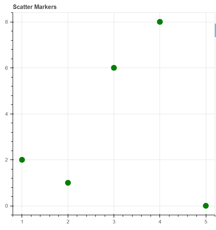
Circle() function
Scatter Circle Markers on the Plot by using the bokeh library is knows as Circle () function
Example of circle function
- from bokeh.plotting import figure as fig
- from bokeh.plotting import output_notebook as ON
- from bokeh.plotting import show
- ON()
- plot1 = fig(plot_width = 500, plot_height = 500, title = “Scatter Markers”)
- plot1.circle([1, 2, 3, 4, 5, 6], [2, 1, 6, 8, 0],
- size = 12, color = “green”, alpha = 1)
- show(plot1)
Output of circle function
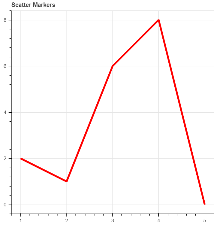
Line() function
Single line by using the bokeh library in Python is knows as Line() function.
Example of line() function.
from bokeh.plotting import figure as fig
from bokeh.plotting import output_notebook as ON
from bokeh.plotting import show
ON()
plot1 = fig(plot_width = 500, plot_height = 500, title = “Scatter Markers”)
plot1.circle([1, 2, 3, 4, 5, 6], [2, 1, 6, 8, 0],
size = 12, color = “green”, alpha = 1)
show(plot1)
Output of line() function.
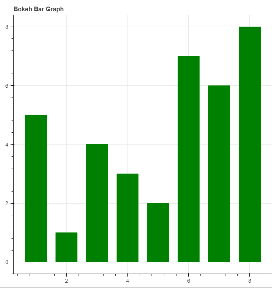
Bar chart
Bar charts are used for representing the categorical data with rectangular bar is knows as bar chart.
Example of Vertical bar chart
from bokeh.plotting import figure as fig
from bokeh.plotting import output_file as OF
from bokeh.plotting import show
output_file(“jtp.html”)
graph1 = fig(title = “Bokeh Bar Graph”)
x = [1, 2, 3, 4, 5, 6, 7, 8]
top1 = [5, 1, 4, 3, 2, 7, 6, 8]
graph1.vbar(x,
top = top1,
width = width1,
color = “green”)
show(graph1)
Output of Vertical bar chart
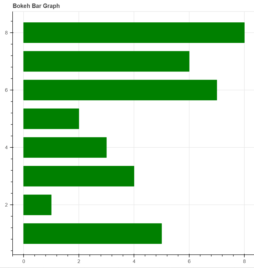
Example of Horizontal Bar Chart
from bokeh.plotting import figure as fig
from bokeh.plotting import output_file as OF
from bokeh.plotting import show
output_file(“jtp.html”)
graph1 = fig(title = “Bokeh Bar Graph”)
x = [1, 2, 3, 4, 5, 6, 7, 8]
right1 = [5, 1, 4, 3, 2, 7, 6, 8]
height1 = 0.7
graph1.hbar(x,
right = right1,
height = height1,
color = “green”)
show(graph1)
Output of Horizontal Bar Chart
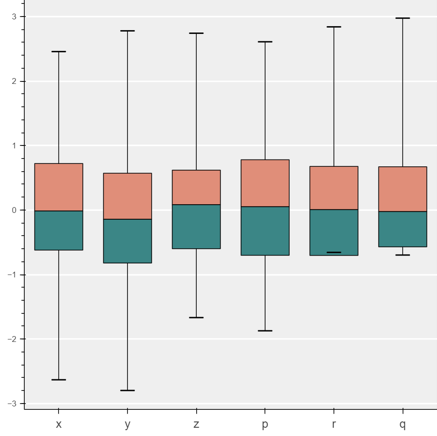
Box Plot
Box plot is use for representing the statistical data on the plot is knows as Box Plot
Example of Box Plot
import numpy as nmp
import pandas as pnd
from bokeh.plotting import figure as fig
from bokeh.plotting import show
cats_1 = list(“xyzprq”)
y_y = nmp.random.randn(2000)
g_1 = nmp.random.choice(cats_1, 2000)
for K, J in enumerate(cats_1):
y_y[g_1 == l] += K // 2
data_frame = pnd.DataFrame(dict(score = y_y, group = g_1))
groups1 = data_frame.groupby(‘group’)
q_1 = groups1.quantile(q = 0.25)
q_2 = groups1.quantile(q = 0.5)
q_3 = groups1.quantile(q = 0.75)
iqr = q3 – q1
upper = q3 + 1.5 * iqr
lower = q1 – 1.5 * iqr
def outliers(group2):
cat_2 = group2.name
return group2[(group2.score > upper.loc[cat_2][‘score’]) | (group2.score < lower.loc[cat_2][‘score’])][‘score’]
out = groups.apply(outliers).dropna()
if not out.empty:
out_x = list(out.index.get_level_values(0))
out_y = list(out.values)
plot1 = fig(tools = “”, background_fill_color = “#efefef”, x_range = cats_1, toolbar_location = None)
q_min = groups1.quantile(q = 0.00)
q_max = groups1.quantile(q = 1.00)
upper.score = [min([x,y]) for (x,y) in zip(list(q_max.loc[:, ‘score’]), upper.score)]
lower.score = [max([x,y]) for (x,y) in zip(list(q_min.loc[:, ‘score’]), lower.score)]
plot1.segment(cats_1, upper.score, cats_1, q_3.score, line_color = “black”)
plot1.segment(cats_1, lower.score, cats_1, q_1.score, line_color = “black”)
plot1.vbar(cats_1, 0.7, q_2.score, q_3.score, fill_color = “#E08E79”, line_color = “black”)
plot1.vbar(cats_1, 0.7, q_1.score, q_2.score, fill_color = “#3B8686”, line_color = “black”)
plot1.rect(cats_1, lower.score, 0.2, 0.01, line_color = “black”)
plot1.rect(cats_1, upper.score, 0.2, 0.01, line_color = “black”)
if not out.empty:
plot1.circle(outx, outy, size = 6, color = “#F38630”, fill_alpha = 0.6)
plot1.xgrid.grid_line_color = None
plot1.ygrid.grid_line_color = “white”
plot1.grid.grid_line_width = 2
plot1.xaxis.major_label_text_font_size = “16px”
show(plot1)
Output of Box Plot
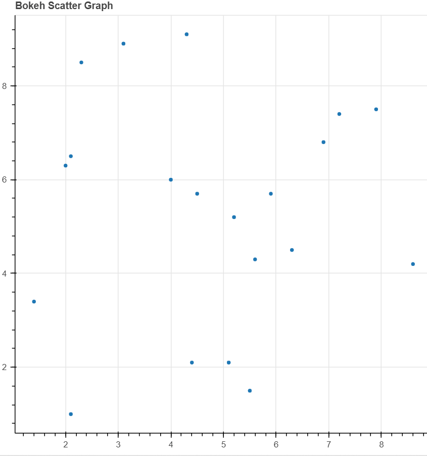
Scatter Plot
A Scatter plot is use for plotting values of two variables in a dataset is knows as Scatter Plot.
Example of Scatter plot
from bokeh.plotting import figure as fig
from bokeh.plotting import output_file as OF
from bokeh.plotting import show
OF(“jtp.html”)
graph1 = fig(title = “Bokeh Scatter Graph”)
x1 = [1.4, 5.1, 5.9, 2.3, 5.6, 8.6, 4.5, 2.1, 3.1, 4.3, 5.5, 4.4, 6.9, 2.1, 4, 5.2, 6.3, 7.2, 7.9, 2]
y1 = [3.4, 2.1, 5.7, 8.5, 4.3, 4.2, 5.7, 6.5, 8.9, 9.1, 1.5, 2.1, 6.8, 1, 6, 5.2, 4.5, 7.4, 7.5, 6.3]
graph1.scatter(x1, y1)
show(graph1)
Output of Scatter Plot
If you have any queries regarding this article or if I have missed something on this topic, please feel free to add in the comment down below for the audience. See you guys in another article.
To know more about Bokeh Library Function please Wikipedia click here.
Stay Connected Stay Safe, Thank you


0 Comments