Matplotlib is a low level graph plotting library in python. It is created by John D. Hunter. Matplotlib is open source and Free. Matplotlib is mostly written in python. python library use to create 2D graphs. it is numerical mathematical extension for NumPy library.

Pyplot Function
The pyplot functions are used to make some changes to figure. The matplotlib.pyplot is the collection command style function. There are usually imported under the plt alias.
Syntax
import matplotlib.pyplot as plt.
Example
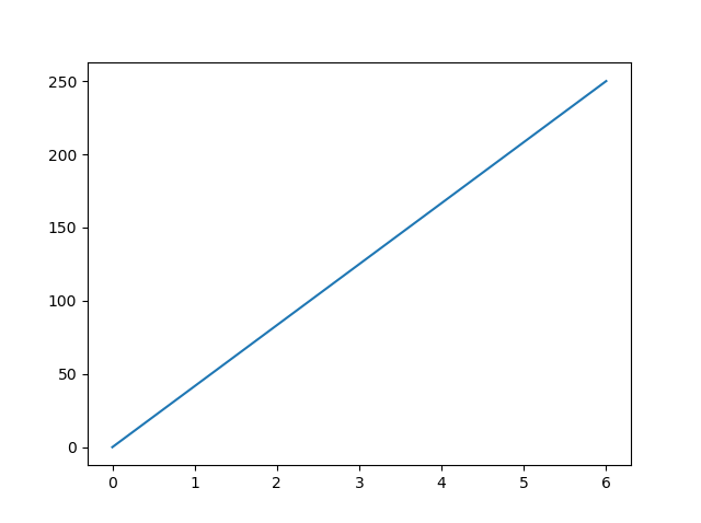
Draw a line in a diagram from position (0,0) to position (6.5,248).
import matplotlib.pyplot as plt
import numpy as npxpoints = np.array([0, 6.5])
ypoints = np.array([0, 248])plt.plot(xpoints, ypoints)
plt.show()
Output of pyplot functions
Matplotlip Plotting
This function is use to draw points in a diagram. By default, the Matplotlip Plotting function draws a line from point to point is knows as Matplotlip Function
The function takes two parameters for specific points in the diagram.
- Parameter 1 is an array contain the points on the x-axis.
- Parameter 2 is an array contain the points on the y-axis.
Example
Draw a line in a diagram from position (4, 9) to position (16, 18):
import matplotlib.pyplot as plt
import numpy as npxpoints = np.array([4, 16])
ypoints = np.array([9, 18])plt.plot(xpoints, ypoints)
plt.show()
Matplotlip Markers
Matplotlip Markers is use both by the marker functionality of the plot and scatter is knows as Matplotip Markers.
Example
Mark each point with a circle:
import matplotlib.pyplot as plt
import numpy as np
ypoints = np.array([4, 8, 10, 7])
plt.plot(ypoints, marker = ‘o’)
plt.show()
| Marker | Description |
| * | Star |
| o | Circle |
| . | Point |
| , | Pixel |
| x | X |
| + | Plus |
| s | Square |
| D | Diamond |
| p | Pentagon |
| H | Hexagon |
| v | Triangle Down |
| ^ | Triangle Up |
| > | Triangle Right |
| < | Triangle Left |
| 1 | Tri Down |
| 2 | Tri Up |
| 3 | Tri Left |
| 4 | Tri Right |
| _ | Hline |
| | | Vline |
Matplotlip Line
Line style to change the style of the plotted line. ls means Line Style.
Line Styles
| Style | Symbol |
| solid | – |
| dotted | : |
| dashed | — |
| dashdot | -. |
| None | or |
Example
Use a dashed line:
import matplotlib.pyplot as plt
import numpy as np
ypoints = np.array([4, 8, 12, 7])
plt.plot(ypoints, linestyle = ‘dashed’)
plt.show()
Matplotlip label
The xlabel and ylabel functions to set a label for the x- and y-axis
Example
Add labels to the x- and y-axis:
import numpy as np
import matplotlib.pyplot as pltx = np.array([81, 86, 91, 96, 101, 106, 111, 116, 121, 126])
y = np.array([241, 251, 261, 271, 281, 291, 301, 311, 321, 331])plt.plot(x, y)
plt.xlabel(“Average book)
plt.ylabel(“Average copy”)plt.show()
Matplotlib Grid
The grid function to add grid lines to the plot.
Example
Add grid lines to the plot
import numpy as np
import matplotlib.pyplot as pltx = np.array([81, 86, 91, 96, 101, 106, 111, 116, 121, 126])
y = np.array([241, 251, 261, 271, 281, 291, 301, 311, 321, 331])plt.title(“Student”)
plt.xlabel(“Average book”)
plt.ylabel(“Average copy”)plt.plot(x, y)
plt.grid()
plt.show()
Matplotlib Subplot
This function you can draw multiple plots in one figure.
Example
Draw 3 plots
import matplotlib.pyplot as plt
import numpy as np#plot 1:
x = np.array([0, 1, 2, 3])
y = np.array([3, 8, 1, 10])plt.subplot(1, 2, 1)
plt.plot(x,y)#plot 2:
x = np.array([0, 1, 2, 3])
y = np.array([10, 20, 30, 40])plt.subplot(1, 2, 2)
plt.plot(x,y)#plot 3:
x = np.array([0, 1, 2, 3])
y = np.array([10, 20, 30, 40])plt.subplot(1, 2, 3)
plt.plot(x,y)plt.show()
Matplotlib Scatter
This function to draw a scatter plot.
Example
A simple scatter plot
import matplotlib.pyplot as plt
import numpy as npx = np.array([4,6,5,7,2,18,12,9,4,11,12,9,6])
y = np.array([99,86,87,88,111,84,103,87,94,79,75,85,86])plt.scatter(x, y)
plt.show()
Matplotlib Bars
This function to draw bar graphs.
Example
Draw 5 bars
import matplotlib.pyplot as plt
import numpy as npx = np.array([“A”, “B”, “C”, “D” ,”E”])
y = np.array([3, 8, 1, 10, 12])plt.bar(x,y)
plt.show()
Matplotlib Histograms
This graph showing frequency distributions.
Example
A simple histogram:
import matplotlib.pyplot as plt
import numpy as npx = np.random.normal(150, 110, 25)
plt.hist(x)
plt.show()
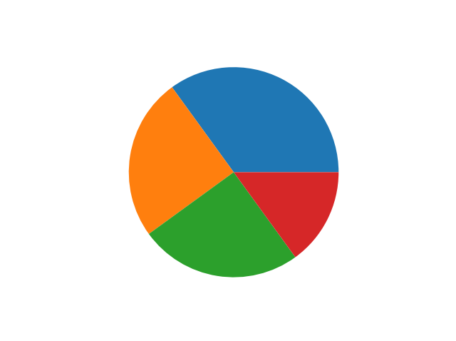
Matplotlib Pie Charts
This function to draw pie charts
Example
A simple pie chart:
mport matplotlib.pyplot as plt
import numpy as npy = np.array([35, 20, 20, 25])
plt.pie(y)
plt.show()
If you have any queries regarding this article or if I have missed something on this topic, please feel free to add in the comment down below for the audience. See you guys in another article.
To know more about Matplotlib please Wikipedia click here
Stay Connected Stay Safe, Thank you


0 Comments