Seaborn is an amazing visualization library for graphics statistical plotting in Python. Seaborn provides beautiful default styles and many color palettes to make statistical plots more attractive. It is built on the matplotlip.
Seaborn is divide into the following various categories
- Distribution plots: Distribution plot is use for examining both types of distributions is knows as Distribution plots.
- Relational plots: Relational plot is use to understand the relation between the two given variables is knows as Relational plots.
- Regression plots: Regression plots in the seaborn library are primarily intends to add an additional visual guide is knows as Regression plots
- Categorical plots: The categorical plots are use to deals with categories of variables is knows as Categorical plots.
- Multi-plot grids: It is a useful approach is to draw multiple instances for the same plot with different subsets of a single dataset is knows as Multi-plot grids.
- Matrix plots: This plots are a type of arrays of the scatterplots is knows as Matrix plots.
Installation of Seaborn library
pip install seaborn
Required dependencies for the seaborn library in Python
- Python install with the latest version.
- SciPy must be install with version 1.0.1 or higher versions.
- Numpy must be install with version 1.13.3 or higher versions.
- Panda must be install with version 0.22.0 or higher versions.
- Statsmodel must be install with version 0.8.0 or higher versions.
- Matplotlib install with versions 2.1.2 or higher versions.
Plotting Chart
Line Plot
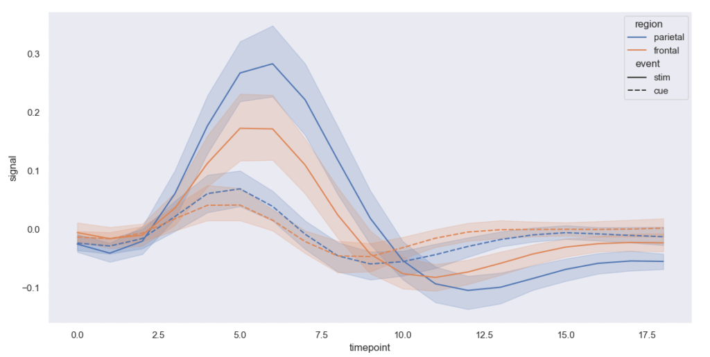
The line plot is the most basic plots presents in the seaborn library in Python. We use the seaborn line plot mainly to visualize the given data in some time-series form is knows as Line Plot.
Example of Line Plot
import seaborn as sns
import matplotlib.pyplot as plt
sns.set(style=”dark”)
FMR = sns.load_dataset(“fmri”)
sns.lineplot(x=”timepoint”,
y=”signal”,
hue=”region”,
style=”event”,
data=FMR)
plt.show()
Output of Line Plot
Dist Plot
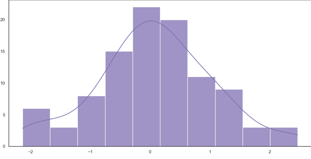
The seaborn dist plots to plot histograms with the given variables and data as a result is knows as Dist Plot.
Example of Dist Plot
import numpy as np
import seaborn as sns
import matplotlib.pyplot as plt
sns.set(style=”white”)
ru = np.random.RandomState(10)
d = ru.normal(size=100)
sns.histplot(d, kde=True, color=”m”)
plot = sns.histplot(d, kde=True, color=”m”)
print(plot)
plt.show()
Output Of Dist Plot
Lmplot
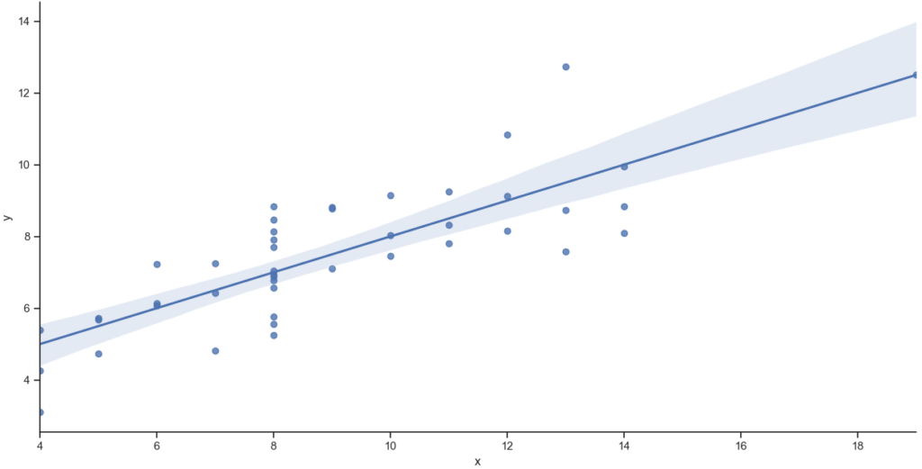
The Lmplot is the basic plots in the seaborn library. The Lmplot shows a line that represents a linear regression model with the data points. we can set x and y variables as the vertical and horizontal labels is knows as Lmplot.
Example of Lmplot
import seaborn as sns
import matplotlib.pyplot as plt
sns.set(style=”ticks”)
ds = sns.load_dataset(“anscombe”)
sns.lmplot(x=”x”, y=”y”, data=ds)
plot = sns.lmplot(x=”x”, y=”y”, data=ds)
print(plot)
plt.show()
Output of Lmplot
Relplot
This relplot is the basic plots in the seaborn library. It is provides the access to some other different axes-level functions which shows the relationships between two variables with semantic mappings of subsets is knows as relplot.
Example of relplot
import seaborn as s
s.set_theme()
tips = s.load_dataset(“tips”)
s.relplot(
data=tips,
x=”total_bill”, y=”tip”, col=”time”,
hue=”smoker”, style=”smoker”, size=”size”,
)
Output of relplot
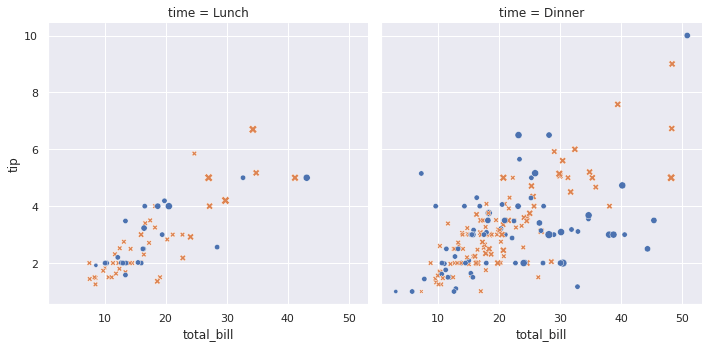
where ,
- Somker
- yes is a bule color
- no is a yellow color
- size
Bar Plot
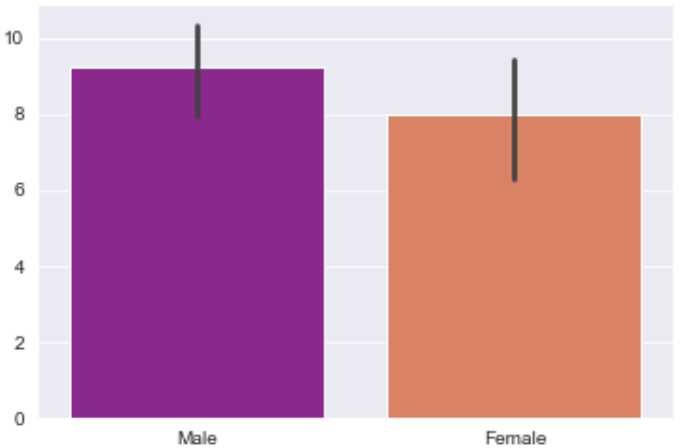
A barplot is basically use to aggregate the categorical data according to some methods and by default its the mean. This plot we choose a categorical column for the x axis and a numerical column for the y axis is knows as Bar Plot.
Example of Bar Plot
sns.set_style(‘darkgrid’)
sns.barplot(x =’sex’, y =’total_bill’, data =df, palette =’plasma’)
importnumpy as np
sns.barplot(x =’sex’, y =’total_bill’, data =df, palette =’plasma’, estimator =np.std)
Output of Bar Plot
If you have any queries regarding this article or if I have missed something on this topic, please feel free to add in the comment down below for the audience. See you guys in another article.
To know more about Seaborn Library Function please Wikipedia click here.
Stay Connected Stay Safe, Thank you
0 Comments